Friday, 30 October 2015

Mode Of Adress

Mode of address is how media presents itself to the audience. For example when looking at a music magazine it is how the magazine shouts at the audience.
When looking at mode of address language is an important part as it allows us to recognise who the target audience is, the genre and purpose of the text that has been written. This depends on what type of language is used as this conveys a meaning, it also refers to the formality and context it is written in. There are four main types of mode of address 1st person, 3rd person, informal and formal.
  • 1st person is when you are talking about yourself, this can be used in a diary entry using words such as 'I' and 'me'
  • 3rd person can be used as a narrative.
  • Formal is when something is more serious due to the audience wanting something of a more informative piece of information, this could be a classical music magazine. this is where more complex vocabulary will be used with a more professional writing style.
  • Where as informal would be a more relaxed type of magazine. This could possibly contain colloquial language where 'slang' could be used and personal pronoun to engage the target audience. this allows the audience to feel as if  they are being directly spoken to. Expletive language may also be used as it is known to be a way of writing used when 'swearing'.
DIRECT MODE OF ADRESS -
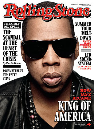
This is where the text directs the reader or audience directly. for example in a magazine this could be asking a question to the audience allowing them to have there own opinion. as well this happens in a magazine when the image is making direct eye contact with the reader to engage them. this draws the reader into the magazine making them want to read the text.

INDIRECT MODE OF ADRESS-
this is when the media is not involving the audience. this is mainly used by all types of media. for example in a film the actor would not direct the audience as that takes away from the drama. also in a magazine this happens when there is an interview with an artist, the questions are asked to the artist not the reader.

LANGUAGE:
Lexis- this is the actual word that is used. this can depend on the genre as it is made to be recognisable by the audience. some text demands a specific lexis, for example in a music magazine there will be words that are used only in the music industry. As when looking into the production of music specific processes effect the understanding of the audience, hence why there is a target audience as they will understand the terminology.

Thursday, 29 October 2015

Analysis Of Colour

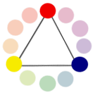
A colour wheel is a visual representation of colours arranged according to their chromatic relationship. the colour wheel is divided equally in to 12 sections, with each section showing a different colour according to its pigment value. As all colours are created from the three primary colours red, green and blue. This means the primary colours format a triangle within the colour wheel. The colour wheel shows the relationship between the primary colours, secondary colours, and complementary colours. Primary Colours are Colours at their basic essence meaning they cannot be created by mixing others. Secondary Colours are made by a mixture of two primaries and Tertiary Colours are produced by a mixture of primary and secondary hues.
Complementary Colours are those located opposite each other on a colour wheel and Analogous Colours located close together.

primary colors
PRIMARY COLOURS-
Primary colours are made up of three key colours, they are the making of any other colour. The three primary colours are red, yellow and blue. these colours cannot be made from any other colour, hence why they are called primary colours.


secondary colorsSECONDARY COLOURS-
Secondary colours are made when mixing two of the primary colours equally making the three secondary colours purple, orange and green.
Orange is made from - red and yellow
Purple is made from - red and blue
tertiary colors
green is made from - blue and yellow


TERTAIRY COLOURS-
Tertiary colours are made when you mix primary and secondary colour together with a ratio of 2:1, primary to secondary. this allows different shades of red, yellow, blue, green, purple and orange.
complementary colors - red and green


COMPLAMENTARY COLOURS-
These are colours located opposite to each other on a colour wheel, they show a contrast as they are the colours that are most opposite to one and other.

analogous colors


ANALOGOUS COLOURS-
These are colours that are located next to one and other on the colour wheel, this shows the most similar in shade, it can also show how a different mixture of colours can slightly change an outcome.

On one side of the colour wheel there are the colours that are known as 'hot' colours and the other side known as 'cold' colours. This is very useful in the making of a magazine as this can help to decipher the mood that your wish to portray.

NEUTRAL COLOURS-
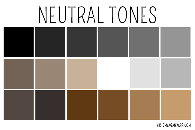
Neutral colours are ones that do not appear on the colour wheel such as white, black, grey, brown and beige. they are colours that can slightly change primary, secondary or tertiary colours to create different shades. they can layer over colours easily and can be mixed and matched.

ACCENT COLOURS-
these colours are uses very little at a time, they are used to bring out a colour brightening the colour scheme. they are also known as a complimentary colour as they work best when the colour is bright or strong colour.

COLOUR HARMONY-
colour harmony is when an arrangement of colours becomes pleasing and attractive to the eye. when this is shown it is known to entice the reader as it shown professionalism and order as it is a balance of colour.
when colours together are not harmonious this means it comes across as boring, allowing  reader/viewer to become uninterested, not one that is wanted when in the creation of a magazine. on the other hand it colour come across and busy and untidy, this can also cause the reader to not want to look as the brain rejects what it sees. this is due to colour harmony simulating order, this is why it is so important.

Wednesday, 28 October 2015

Typography

Typography is the study of the design of fonts, and the way in which the text is laid out on the page. It is looked at to achieve the best desired visual effect across the page and to find the best way to convey the meaning of the word.
It’s one of the primary ways we use it is to pass on information to others. how typography is used in a design is depending on its overall theme, tone and message. It works with your layout, grid and colour scheme to create a well-rounded, professional design. Your choice of fonts and your layout gives your composition its character, pace and style. It also helps the reader gain a greater insight into the subject of the design. 
Another way of explaining typography  is that it is a way of letters being able to communicate through there style expressing a feeling. Typography if affective determines if the words are effective to the reader. it can vary from a traditional style of writing to a digital style that is shown as modern. Typography doesn't just stop at the style it looks at components such as the selection of the point size, stroke length, and spacing.
 
 
Typeface and fonts
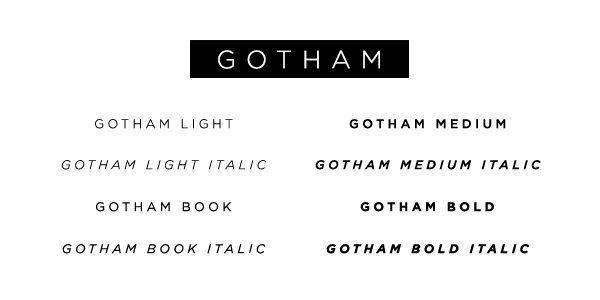
A typeface is a range of different fonts where as a font is the style that is chose within that typeface, for example if the typeface is bold or italic.


Image result for proper terminology for the anatomy typographyAnatomy
Anatomy is the elements that make up the parts of the typeface. A typeface can be made up of an ascender, decender, arm, counter, sterif, stem and stroke. It also focuses on the size whether that's the cap height or the x-height.


Friday, 23 October 2015

Genres Compared

Music Magazine Genres
Music magazines come in different types of genres depending on the type of artists that are shown in the magazine. I have been looking into different types such as rock and pop this has helped me get inspiration for my own magazine and helped me to understand the different layouts for each genre. I have been looking at the differences and similarities comparing their styles giving me a better idea of how i would design my magazine.

Genres Compared
Shown here is two types of magazine genres, there are many differences in the magazines styles which is why i chose to compare a rock and pop magazine as it would show the wide variety that music magazines show.The left magazine being  'NME' which is a rock/indie magazine.The main image of this magazine shows Jake Bugg, this magazine will attract people who like the style of music that he sings or similar music types. 'NME' uses simple colours such as red and yellow that work in contrast to each other making the writing stand out.
Whereas the magazine on the right called 'we love pop' is the complete opposite the 'NME'. It is a pop magazine made to attract teenages and young children as it has Tulisa as the main image. There are also images of One Direction meaning this will attract people who enjoy pop or similar type music. The magazine is also very different as it uses bright colour, using pink and light blue, this is done to become appealing to their main fan base of teenage girls. Looking at both magazines there is a obvious difference in the type of people they are trying to attract and the music genre they show.


Although i have only looked and rock and pop magazines these are not the only magazines available. There are also many other types of magazine genres looking at different audiences. I have looked into detail of two other types:


Hip-Hop magazine

Hip-Hop magazines appeal to young adults and teenages due to this genre of music being very popular amongst the younger generation. As well as the music type Hip-Hop magazines also appeal to people who like the culture such as the way the artists act and the way they dress such as work boots, high-top trainers, skinny or baggy jeans and statement clothing. Hip-Hop magazines usually have an element of afro american culture attracting people of culture around the age of 11-36. 
Hip-Hop magazines mainly use reds, blacks and whites this is because they stick with a simple colour theme. This allows the magazine to attract to both a male and female audience. The colour theme is usually dark and edgy with simple statement stories involving hip-hop artists.


Jazz Magazine

Jazz magazines use one simple main colour such as yellow or blue then mainly use blacks and whites for the writing, they do this to connote the peaceful calm feel of there music.  
Jazz magazines aim at an audience between the ages of 30 and 50, looking at both types of gender. Although the jazz has expanded to a younger audience of people down to the age of 20 due to artists such as amy winehouse. This type of genre will attract people that enjoy listening to live bands , it also attracts people that wish to express their feelings as jazz is a way to show passion.


Tuesday, 20 October 2015

What Is A Music Magazine

A music magazine is a magazine that is all about music,focusing on music culture and style. A typical music magazine will include interviews, music news, photoshoots, essays, record reviews, reviews from concerts, also in some magazines they occasionally have covermount records attached.
Music magazines come in different types of genre depending on the style and the audience they wish to attract. There are many types such as rock, pop, RnB, hip-hop or classical.
Each music magazine has a niche audience this is a certain type of people that are interested in a particular type of genre. This is based on the appearance of the cover meaning the type of person in the main image as some people may be attracted by a particular icon. It is also based on the type of music the magazine advertises, creating the reason for people having different tastes in music,also depending on there age.

Tuesday, 13 October 2015

Introduction

Hi, my name is Emma Bugler and i have created this blog to show the progress in the making of my music magazine for my AS coursework. To prepare for this i have also made a blog showing my school magazine:
http://emmaschoolmagazine.blogspot.co.uk/

In creating my school magazine i have learnt many skills, I have used photoshop and picmonkey to edit and arrange my images and text. I also learnt about the conventions of a magazine, his has helped me to layout my magazine in a style that would best advertise the words written and the images i chose to use. Having this knowledge is going to allow me to create a professional looking music magazine. My final outcome of my music magazine and my blog will show my progress in using photoshop and editing my magazine, meaning it will be clear that i have effectively improved my skills.

To improve my skills and knowledge of a music magazine i will be researching  different magazines looking into their genre and style. I will understand how to design my magazine depending on the target audience to make it to appeal to the reader. I will also look and the conventions of the different genre magazines. All of this research will help me understand and give me ideas on how to design my magazine to make it look most appealing.