Tuesday, 15 December 2015

Tuesday, 24 November 2015
Social media research
To find out what text would be best for my masthead i uploaded four different font types to Twitter. I asked 'what font do you think would be best for my indie rock magazine?'. I used twitter as this type of social media is mainly used by my target audience of teenagers/young adults.
These were my font types:

These were my font types:
1
2
3
4
This is the feedback i got from Twitter:
From using social media research, looking at various peoples opinions from twitter it is clear to see that the 4th and 2nd were not very popular at all, for this reason i will no be using them at all. Also after analysing my research it is obvious to me that the 3rd one was favorited. i am happy with this as this is the font that i wanted to use as i feel it sticks with the indie rock theme.
Friday, 20 November 2015
Focus Group
To find out what would be best for my magazine i have used a focus group to help me decide my design. This will help me as i will get a further detailed response than my questionnaire. I have chosen to ask Ellie, Matilda and Becca as they are in the age that i am trying to attract.
Emma- What name do you think would be best for my indie rock magazine out of 'Diverse', 'Majesty', 'Rhythm', and 'Conform'?
Matilda- personally my favourite would be 'Rhythm' because i like that it sticks to the music idea, but i do like 'Diverse' so either would be good!
Becca- yeah, i like 'Diverse' it goes with the different controversial indie style
Ellie- see i do like 'Majesty' but i don't think its right for a indie rock magazine, so i agree with Becca 'Diverse' is my favourite.
Emma- what colour scheme do you think would look best on a indie rock magazine? burgundy, blue and white or black white and red, or blue red and black?
Ellie- either black white and red or blue red and black because i think red sticks to the typical conventions of a rock magazine.
Matilda- see i only like black white and red as it keeps it more simple, this way you can brighten up your magazine with the pictures you use.
Becca- i agree that way your magazine will still look professional and won't look messy.
Emma- How much would you pay for a music magazine? £3, £4 or £2.50?
Becca- £4 is way too much for a magazine, i wouldn't buy it if it was that much.
Ellie- i think that too , Either £2.50 or £3 would be better.
Matilda- yeah, i think £3 would be best, its not to cheep to make it come across as a bad magazine but not to expensive to make people not by it.
Emma- What location do you think i should photograph my images? Brick lane, South Bank, Central London or Camden?
Ellie- i really like camden, only because of the background that you can find of graffiti, it will make your magazine really stand out.
Matilda- yeah i like camden as well, your magazine will look really interesting with the indie type background. although you could go the opposite way and use the rural area or central london.
Becca- no i don't think Central ?London will work very well, use brick lane or camden to stick with the edgy indie rock style.
Emma- What colour would be best for my logo? white and black, blue and black or red and black?
Matilda- well as i like the colour scheme of red black and white i think you should go with red and black or black and white. personally id like red and black as it will stand out more.
Ellie- well i do like the idea blue but it won't go with red if you decide to go for that colour scheme, just stick to red and black i think.
Becca- i agree just stick to red and black.
Emma- How often should my magzine be published? monthly, yearly or weekly?
Ellie- yearly is way to long , either weekly or monthly depending on how many stories could be found.
Matilda- don't do weekly! you wont have enough time in between, the magazine will become repetitive.
Becca- Yeah go with monthly that allows enough time to perfect the magazine.
Emma- Would you like it if my magazine had the opportunity to win a competition?
Ellie- yeah i really like that idea, it will give your magazine a selling point.
Becca- i agree, as long as it doesn't become a large focal point of your magazine and take way form the actual point.
Matilda- no you should, the whole point is to sell the magazine, this will help out with that.
Emma- What is your favour artist? lily allen, marina and the diamond, churches or two door cinema club?
Ellie- i like lily allen the best, she could also be an icon for the buyers making fans of hers buy it.
Matilda- you could say that about all there fans, i think marina and the diamond or two door cinema club would be better for the type of magazine you are making.
Becca- i agree with ellie about lily allen but i do like marina and the diamond.
Emma- What article would you like to read in my magazine? Interviews, Celebrity gossip or reviews?
Becca- Reviews would be boring and wouldn't go very well with a music magazine
Ellie- yeah that is true, celebrity gossip will make the magazine a lot more interesting it will grab the attention of the reader, definitely use that!
Matilda- i like the idea of celebrity gossip but in using interviews you can have celebrity gossip as well.
Emma- Would it interest you if my magazine had adverts for upcoming gigs?
Matilda- yeah why not, obviously it won't be a focal point but it will bring in a larger audience if you use lots of artists.
Ellie- i think thats a good idea, definitely do it.
Becca- but i don't think you need it, only if you need to fill in space use it i think.
Emma- What name do you think would be best for my indie rock magazine out of 'Diverse', 'Majesty', 'Rhythm', and 'Conform'?
Matilda- personally my favourite would be 'Rhythm' because i like that it sticks to the music idea, but i do like 'Diverse' so either would be good!
Becca- yeah, i like 'Diverse' it goes with the different controversial indie style
Ellie- see i do like 'Majesty' but i don't think its right for a indie rock magazine, so i agree with Becca 'Diverse' is my favourite.
Emma- what colour scheme do you think would look best on a indie rock magazine? burgundy, blue and white or black white and red, or blue red and black?
Ellie- either black white and red or blue red and black because i think red sticks to the typical conventions of a rock magazine.
Matilda- see i only like black white and red as it keeps it more simple, this way you can brighten up your magazine with the pictures you use.
Becca- i agree that way your magazine will still look professional and won't look messy.
Emma- How much would you pay for a music magazine? £3, £4 or £2.50?
Becca- £4 is way too much for a magazine, i wouldn't buy it if it was that much.
Ellie- i think that too , Either £2.50 or £3 would be better.
Matilda- yeah, i think £3 would be best, its not to cheep to make it come across as a bad magazine but not to expensive to make people not by it.
Emma- What location do you think i should photograph my images? Brick lane, South Bank, Central London or Camden?
Ellie- i really like camden, only because of the background that you can find of graffiti, it will make your magazine really stand out.
Matilda- yeah i like camden as well, your magazine will look really interesting with the indie type background. although you could go the opposite way and use the rural area or central london.
Becca- no i don't think Central ?London will work very well, use brick lane or camden to stick with the edgy indie rock style.
Emma- What colour would be best for my logo? white and black, blue and black or red and black?
Matilda- well as i like the colour scheme of red black and white i think you should go with red and black or black and white. personally id like red and black as it will stand out more.
Ellie- well i do like the idea blue but it won't go with red if you decide to go for that colour scheme, just stick to red and black i think.
Becca- i agree just stick to red and black.
Emma- How often should my magzine be published? monthly, yearly or weekly?
Ellie- yearly is way to long , either weekly or monthly depending on how many stories could be found.
Matilda- don't do weekly! you wont have enough time in between, the magazine will become repetitive.
Becca- Yeah go with monthly that allows enough time to perfect the magazine.
Emma- Would you like it if my magazine had the opportunity to win a competition?
Ellie- yeah i really like that idea, it will give your magazine a selling point.
Becca- i agree, as long as it doesn't become a large focal point of your magazine and take way form the actual point.
Matilda- no you should, the whole point is to sell the magazine, this will help out with that.
Emma- What is your favour artist? lily allen, marina and the diamond, churches or two door cinema club?
Ellie- i like lily allen the best, she could also be an icon for the buyers making fans of hers buy it.
Matilda- you could say that about all there fans, i think marina and the diamond or two door cinema club would be better for the type of magazine you are making.
Becca- i agree with ellie about lily allen but i do like marina and the diamond.
Emma- What article would you like to read in my magazine? Interviews, Celebrity gossip or reviews?
Becca- Reviews would be boring and wouldn't go very well with a music magazine
Ellie- yeah that is true, celebrity gossip will make the magazine a lot more interesting it will grab the attention of the reader, definitely use that!
Matilda- i like the idea of celebrity gossip but in using interviews you can have celebrity gossip as well.
Emma- Would it interest you if my magazine had adverts for upcoming gigs?
Matilda- yeah why not, obviously it won't be a focal point but it will bring in a larger audience if you use lots of artists.
Ellie- i think thats a good idea, definitely do it.
Becca- but i don't think you need it, only if you need to fill in space use it i think.
Questionnaire results
I have asked a range of 50 people of the target audience age of 16-25. After collecting all of my results i will now analyze them to help me decide how i will design my magazine.


What name do you think would be best for my indie rock magazine?
After collecting my results it is clear to see that 'Diverse' was the favourite as 56% prefered it, due to this large favour i have decided that this will be the name of my magazine. this was easy as the other names got low scores with 'Majesty' 10%, 'Rhythm' 14% and 'Conform' with 20%.
What colour Scheme is best for my magazine?
The public have chosen red, black and white as the colour scheme for my magazine as the results showed 44%, because of this i will use this colour scheme. Although it was closely followed by burgundy, blue and white with 36% and blue, red and black wasn't a popular choice with only 20%.
How much would you pay for my magazine?
I agree with the results of this question as 50% of 30 said that they would pay £3 for a magazine, in my opinion this is a reasonable price to pay. Both £2.50 and £4 scored 25%.
Where do you think would be the best location for my magazine?
Both brick lane and camden had 32% of people thinking that i should photograph my model in them locations, i agree with this and will take my photos there. although only 20% of people said that sound back would be a god place i am still going to experiment and take photos in that location. central london had the lowest with only 16%.
What colour would be best for my logo?
Although most people felt that blue and black would be best for the logo with 49% i am going against this and i will use black and red which scored 34% as this will go better with my colour scheme. i may also experiment with white and black although only 17% chose that.
How often should my magazine be published?
I agree with the 56% of people that think monthly would be the best as this gives me enough time to come up with interesting articles. 32% of people thought weekly and 12% think yearly.
Would you like it if my magazine had a opportunity to win a competition?
 As i thought majority voted yes with 67%, this means i will advertise an opportunity to meet an indie artist. only 33% said no.
What is your favourite artist?


What is your favourite artist?
Due to marina and the diamond getting 30% and lily allen getting 29% they will both be featured in my magazine. as churches only got 20% and two door cinema club got 21% they will not be featured.
What articles would you like to read in my magazine?
i will have interviews and celebrity gossip as they both had 40%, i believe this will make for an interesting magazine. i will not have reviews as it is clear that many people wouldn't read them as they only got 20%.
Would it interest you if my magazine had adverts for upcoming gigs?
although 44% of people said no, i will include upcoming gigs as 56% of people think this would be a good idea,
Questionnaire
What name do you think would be best for my indie rock magazine?
- Diverse
- Majesty
- Rhythm
- Conform
What Colour Scheme would be best for my magazine?
- blue red and black
- red black and white
- burgundy blue and white
How much would you pay for my magazine?
- £3
- £2.50
- £4
Where do you think would be the best location for my photoshoot?
- Brick Lane
- Camden
- Central London
- South Bank
What colour would be best for my logo?
- black and red
- white and black
- blue and black
How often should by magazine be be published?
- Weekly
- Monthly
- Yearly
Would you like it if my magazine had a opportunity to win a competition?
- Yes
- No
What is your favorite artist?
- Marina and the diamonds
- Lily allen
- Churches
- Two door cinema club
What articles would you like to read in a magazine?
- interview
- revews
- celebrity gossip
Would it interest you if my magazine had adverts for upcoming gigs?
- Yes
- No

Star Image
Richard Dyer's Star Image
 Stars as Construction
 For my star image i will be using a female model to appeal to the indie rock genre. I will style her in a way that will appeal to the audience age of 16-25 year olds. i am going to style my model in clothing that is casual and rocky. I am going to use this image of Gwen Stefani as inspiration as she is dressed in black and white casual clothing. I am going to use props such as glassed to recreate this type of image denoting an indie look. i will also use this type of make up, using dark lipstick. when taking my photos i will create a character for my model making her appeal as confident and an icon to females. I want to inspire women to dress in any way they want as my model will.
'pop stars' have changed over the years, in media terms they are interchangeable meaning they have changed to become an icon. They change them into a style of person to become recognisable for the clothing they wear and the type of music they sing giving them an identity and a persona. The reason so many artists are now described as pop stars are due to the fact that this allows them to quickly have a status of power. Many managers publish interesting stories to publicises relationships, actions to feature in popular magazines, in doing this starts can become forgettable relating to the music and are then known for the outfit and style they have. Regardless of this any pop stars still keep up there star quality, keeping there 'brand awareness' among a wide audience.
It is said by Dyer that a star image is not a real person, they are one that is constructed out of a range of materials to advertise them
Stars as Construction
Stars are constructed to come across to the public as 'real people' showing real emotions and real life situations. This is done so they can connect with the audience. In the making of a 'pop star' they allow them to contain USP so that there style cannot be copied. For example Lady GaGa is known for her 'out there' outfits using various ideas, she is recognized for wearing a meat outfit. Miley Cyrus has also made herself unique by wearing skimpy outfits and acting in a way to shock her fans. However as the public it is known that we prefer a star that is constructed by themselves as this way we know they are real.
Industry and Audience
Stars have been manufactured to make money from their target audience by connecting through parts of their persona creating fans. Record labels shape their stars to fit their audience type. for example it is clear to see that most boy bands are similar. Although some people do not conform to this type so they make bands that are 'ugly' or 'real' so that further audiences are brought in. Industries have become very aware of the audience they need to cater for , this way they have a wide range of starts to appeal to all. they create stars that vary in the type of genre they sing to do this. Also they use starts to create a fashion trend changing there hairstyle and culture to make them stand out to a wider audience.
Character and Personality
A star will always start of as 'real' appealing to the public by their gender, race and background. this then changed through their career constructing them in a way there lable feels necessary. This way we still feel as if they are still connected to there culture and background making thiem appear as real. Starts provide the audience with a style that they will think to be stylish for that generation making them an icon. This can cause problems as they create an unrealistic dream, for example that women must be beautiful and thin.
My Star Image
For my star image i will be using a female model to appeal to the indie rock genre. I will style her in a way that will appeal to the audience age of 16-25 year olds. i am going to style my model in clothing that is casual and rocky. I am going to use this image of Gwen Stefani as inspiration as she is dressed in black and white casual clothing. I am going to use props such as glassed to recreate this type of image denoting an indie look. i will also use this type of make up, using dark lipstick. when taking my photos i will create a character for my model making her appeal as confident and an icon to females. I want to inspire women to dress in any way they want as my model will. Thursday, 19 November 2015
Initial Ideas
INITIAL IDEAS
I looked into the many different genres of music magazines when looking into the conventions of a magazine. After all of my research i found that my favorite genre was 'indie rock' due to the creative images and colours used, i found it made for a very alternative magazine. I chose to make an 'indie rock' magazine as i feel i can be very creative in the locations of my photoshoots making them very diverse. I also like that i can style my model in individual clothing to connote the indie genre. My magazine will appeal to a niche target audience as it directs itself to people who listen to rock indie music or wear that type of clothing with the stereotypical lifestyle. On my blog it shows how i have looked into the style of 'NME' an indie magazine this has helped me to understand the style of them. I have also annotated two rock magazines, this way I now understand the conventions that they go by. In looking at both of these I have been inspires to use both ideas to create a magazine. I have also been inspired when annotating the 'classic pop' magazine as the colours used in the images on the double page spread was bright and inventive.
After looking into many different 'indie rock' magazines it is clear to see that the world of indie rock is male dominated with mainly males seen throughout the magazines. This is something I will challenge by starting females in my magazine.
POSSIBLE NAME CHOCIES
Diverse
Majesty
Rhythm
Conform
GENRE
Indie rock music - I have chosen this genre of music as it is unique and individual making for a very creative magazine. I believe that this genre is the best stile for me to go by as after looking at styles of indie magazines I have a good idea of locations for my photoshoots, they will be in contemporary locations. I also enjoyed reading indie rock magazines so I think I will have a good idea of how to layout my magazine due to my research on the conventions.
HOUSE STYLE
House style is the layout and structure of a magazine it includes the colour schemes and logos. They are made so that it looks professional and sophisticate with a consistent layout.
in my magazine I will be using a consistent colour scheme throughout my magazine using blacks whites and reds, although my images will broaden my choice of colour. I will also use similar fonts through out to make the magazine tie together.
MODE OF ADDRESS
In my magazine the mode of address will be very informal as I wish to connect with the reader making it more personal. I will do this my using colloquial language connoting a chatty style as this is the language used in other indie rock magazines. I have chose to use informal language as this will attract my target audience of the younger generations/teenagers as they will be able to connect with the fun style of language encouraging them to read the magazine.
MAIN MODEL
I will be using a female for my main model, I will dress her in indie casual clothing, it will connote a care free style. I will use dramatic make up with dark lipstick to give the sense of an edgy style. when I am styling my model I will make sure to stick to the typical indie style so that the indie genre is portrayed.
PUBLISHING MY MAGAZINE
My magazine will be published monthly as this will allow time for the change in style and for the artists to change with the popularity of them at the time. this will allow for many different stories making my magazine very interesting in each issue. also realising it each month will allow me to look over the magazine carefully to make it look professional with creative images making my magazine successful.
FUTURE RESEARCH
I will be creating a questionnaire to help me decide the name, colour scheme and price. I will present this questionnaire to the age range of 14-19 as this sticks to the teenage target audience as I want my magazine to be appealing to them.
I looked into the many different genres of music magazines when looking into the conventions of a magazine. After all of my research i found that my favorite genre was 'indie rock' due to the creative images and colours used, i found it made for a very alternative magazine. I chose to make an 'indie rock' magazine as i feel i can be very creative in the locations of my photoshoots making them very diverse. I also like that i can style my model in individual clothing to connote the indie genre. My magazine will appeal to a niche target audience as it directs itself to people who listen to rock indie music or wear that type of clothing with the stereotypical lifestyle. On my blog it shows how i have looked into the style of 'NME' an indie magazine this has helped me to understand the style of them. I have also annotated two rock magazines, this way I now understand the conventions that they go by. In looking at both of these I have been inspires to use both ideas to create a magazine. I have also been inspired when annotating the 'classic pop' magazine as the colours used in the images on the double page spread was bright and inventive.
After looking into many different 'indie rock' magazines it is clear to see that the world of indie rock is male dominated with mainly males seen throughout the magazines. This is something I will challenge by starting females in my magazine.
POSSIBLE NAME CHOCIES
Diverse
Majesty
Rhythm
Conform
GENRE
Indie rock music - I have chosen this genre of music as it is unique and individual making for a very creative magazine. I believe that this genre is the best stile for me to go by as after looking at styles of indie magazines I have a good idea of locations for my photoshoots, they will be in contemporary locations. I also enjoyed reading indie rock magazines so I think I will have a good idea of how to layout my magazine due to my research on the conventions.
HOUSE STYLE
House style is the layout and structure of a magazine it includes the colour schemes and logos. They are made so that it looks professional and sophisticate with a consistent layout.
in my magazine I will be using a consistent colour scheme throughout my magazine using blacks whites and reds, although my images will broaden my choice of colour. I will also use similar fonts through out to make the magazine tie together.
MODE OF ADDRESS
In my magazine the mode of address will be very informal as I wish to connect with the reader making it more personal. I will do this my using colloquial language connoting a chatty style as this is the language used in other indie rock magazines. I have chose to use informal language as this will attract my target audience of the younger generations/teenagers as they will be able to connect with the fun style of language encouraging them to read the magazine.
MAIN MODEL
I will be using a female for my main model, I will dress her in indie casual clothing, it will connote a care free style. I will use dramatic make up with dark lipstick to give the sense of an edgy style. when I am styling my model I will make sure to stick to the typical indie style so that the indie genre is portrayed.
PUBLISHING MY MAGAZINE
My magazine will be published monthly as this will allow time for the change in style and for the artists to change with the popularity of them at the time. this will allow for many different stories making my magazine very interesting in each issue. also realising it each month will allow me to look over the magazine carefully to make it look professional with creative images making my magazine successful.
FUTURE RESEARCH
I will be creating a questionnaire to help me decide the name, colour scheme and price. I will present this questionnaire to the age range of 14-19 as this sticks to the teenage target audience as I want my magazine to be appealing to them.


Tuesday, 17 November 2015


Sunday, 15 November 2015


Tuesday, 10 November 2015
Friday, 30 October 2015
Mode Of Adress
Mode of address is how media presents itself to the audience. For example when looking at a music magazine it is how the magazine shouts at the audience.
When looking at mode of address language is an important part as it allows us to recognise who the target audience is, the genre and purpose of the text that has been written. This depends on what type of language is used as this conveys a meaning, it also refers to the formality and context it is written in. There are four main types of mode of address 1st person, 3rd person, informal and formal.
This is where the text directs the reader or audience directly. for example in a magazine this could be asking a question to the audience allowing them to have there own opinion. as well this happens in a magazine when the image is making direct eye contact with the reader to engage them. this draws the reader into the magazine making them want to read the text.
INDIRECT MODE OF ADRESS-
this is when the media is not involving the audience. this is mainly used by all types of media. for example in a film the actor would not direct the audience as that takes away from the drama. also in a magazine this happens when there is an interview with an artist, the questions are asked to the artist not the reader.
LANGUAGE:
Lexis- this is the actual word that is used. this can depend on the genre as it is made to be recognisable by the audience. some text demands a specific lexis, for example in a music magazine there will be words that are used only in the music industry. As when looking into the production of music specific processes effect the understanding of the audience, hence why there is a target audience as they will understand the terminology.
When looking at mode of address language is an important part as it allows us to recognise who the target audience is, the genre and purpose of the text that has been written. This depends on what type of language is used as this conveys a meaning, it also refers to the formality and context it is written in. There are four main types of mode of address 1st person, 3rd person, informal and formal.
- 1st person is when you are talking about yourself, this can be used in a diary entry using words such as 'I' and 'me'
- 3rd person can be used as a narrative.
- Formal is when something is more serious due to the audience wanting something of a more informative piece of information, this could be a classical music magazine. this is where more complex vocabulary will be used with a more professional writing style.
- Where as informal would be a more relaxed type of magazine. This could possibly contain colloquial language where 'slang' could be used and personal pronoun to engage the target audience. this allows the audience to feel as if they are being directly spoken to. Expletive language may also be used as it is known to be a way of writing used when 'swearing'.
This is where the text directs the reader or audience directly. for example in a magazine this could be asking a question to the audience allowing them to have there own opinion. as well this happens in a magazine when the image is making direct eye contact with the reader to engage them. this draws the reader into the magazine making them want to read the text.
INDIRECT MODE OF ADRESS-
this is when the media is not involving the audience. this is mainly used by all types of media. for example in a film the actor would not direct the audience as that takes away from the drama. also in a magazine this happens when there is an interview with an artist, the questions are asked to the artist not the reader.
LANGUAGE:
Lexis- this is the actual word that is used. this can depend on the genre as it is made to be recognisable by the audience. some text demands a specific lexis, for example in a music magazine there will be words that are used only in the music industry. As when looking into the production of music specific processes effect the understanding of the audience, hence why there is a target audience as they will understand the terminology.
Thursday, 29 October 2015
Analysis Of Colour

Complementary Colours are those located opposite each other on a colour wheel and Analogous Colours located close together.

PRIMARY COLOURS-
Primary colours are made up of three key colours, they are the making of any other colour. The three primary colours are red, yellow and blue. these colours cannot be made from any other colour, hence why they are called primary colours.
 SECONDARY COLOURS-
 Secondary colours are made when mixing two of the primary colours equally making the three secondary colours purple, orange and green.
Orange is made from - red and yellow
Purple is made from - red and blue

green is made from - blue and yellow
TERTAIRY COLOURS-
Tertiary colours are made when you mix primary and secondary colour together with a ratio of 2:1, primary to secondary. this allows different shades of red, yellow, blue, green, purple and orange.

COMPLAMENTARY COLOURS-
These are colours located opposite to each other on a colour wheel, they show a contrast as they are the colours that are most opposite to one and other.

ANALOGOUS COLOURS-
These are colours that are located next to one and other on the colour wheel, this shows the most similar in shade, it can also show how a different mixture of colours can slightly change an outcome.
 On one side of the colour wheel there are the colours that are known as 'hot' colours and the other side known as 'cold' colours. This is very useful in the making of a magazine as this can help to decipher the mood that your wish to portray.
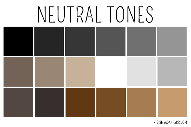
NEUTRAL COLOURS-
Neutral colours are ones that do not appear on the colour wheel such as white, black, grey, brown and beige. they are colours that can slightly change primary, secondary or tertiary colours to create different shades. they can layer over colours easily and can be mixed and matched.
ACCENT COLOURS-
these colours are uses very little at a time, they are used to bring out a colour brightening the colour scheme. they are also known as a complimentary colour as they work best when the colour is bright or strong colour.
COLOUR HARMONY-
colour harmony is when an arrangement of colours becomes pleasing and attractive to the eye. when this is shown it is known to entice the reader as it shown professionalism and order as it is a balance of colour.
when colours together are not harmonious this means it comes across as boring, allowing reader/viewer to become uninterested, not one that is wanted when in the creation of a magazine. on the other hand it colour come across and busy and untidy, this can also cause the reader to not want to look as the brain rejects what it sees. this is due to colour harmony simulating order, this is why it is so important.
Wednesday, 28 October 2015
Typography
Typography is the study of the design of fonts, and the way in which the text is laid out on the page. It is looked at to achieve the best desired visual effect across the page and to find the best way to convey the meaning of the word.
 It’s one of the primary ways we use it is to pass on information to others. how typography is used in a design is depending on its overall theme, tone and message. It works with your layout, grid and colour scheme to create a well-rounded, professional design. Your choice of fonts and your layout gives your composition its character, pace and style. It also helps the reader gain a greater insight into the subject of the design.
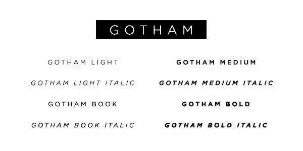
 Anatomy
Anatomy is the elements that make up the parts of the typeface. A typeface can be made up of an ascender, decender, arm, counter, sterif, stem and stroke. It also focuses on the size whether that's the cap height or the x-height.
It’s one of the primary ways we use it is to pass on information to others. how typography is used in a design is depending on its overall theme, tone and message. It works with your layout, grid and colour scheme to create a well-rounded, professional design. Your choice of fonts and your layout gives your composition its character, pace and style. It also helps the reader gain a greater insight into the subject of the design.
Another way of explaining typography is that it is a way of letters being able to communicate through there style expressing a feeling. Typography if affective determines if the words are effective to the reader. it can vary from a traditional style of writing to a digital style that is shown as modern. Typography doesn't just stop at the style it looks at components such as the selection of the point size, stroke length, and spacing.
Typeface and fonts
A typeface is a range of different fonts where as a font is the style that is chose within that typeface, for example if the typeface is bold or italic.
AnatomyAnatomy is the elements that make up the parts of the typeface. A typeface can be made up of an ascender, decender, arm, counter, sterif, stem and stroke. It also focuses on the size whether that's the cap height or the x-height.
Friday, 23 October 2015
Genres Compared
Music Magazine Genres
Music magazines come in different types of genres depending on the type of artists that are shown in the magazine. I have been looking into different types such as rock and pop this has helped me get inspiration for my own magazine and helped me to understand the different layouts for each genre. I have been looking at the differences and similarities comparing their styles giving me a better idea of how i would design my magazine.
Genres Compared
Shown here is two types of magazine genres, there are many differences in the magazines styles which is why i chose to compare a rock and pop magazine as it would show the wide variety that music magazines show.The left magazine being 'NME' which is a rock/indie magazine.The main image of this magazine shows Jake Bugg, this magazine will attract people who like the style of music that he sings or similar music types. 'NME' uses simple colours such as red and yellow that work in contrast to each other making the writing stand out.
Whereas the magazine on the right called 'we love pop' is the complete opposite the 'NME'. It is a pop magazine made to attract teenages and young children as it has Tulisa as the main image. There are also images of One Direction meaning this will attract people who enjoy pop or similar type music. The magazine is also very different as it uses bright colour, using pink and light blue, this is done to become appealing to their main fan base of teenage girls. Looking at both magazines there is a obvious difference in the type of people they are trying to attract and the music genre they show.


Although i have only looked and rock and pop magazines these are not the only magazines available. There are also many other types of magazine genres looking at different audiences. I have looked into detail of two other types:
Hip-Hop magazine
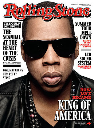 Hip-Hop magazines appeal to young adults and teenages due to this genre of music being very popular amongst the younger generation. As well as the music type Hip-Hop magazines also appeal to people who like the culture such as the way the artists act and the way they dress such as work boots, high-top trainers, skinny or baggy jeans and statement clothing. Hip-Hop magazines usually have an element of afro american culture attracting people of culture around the age of 11-36.
Hip-Hop magazines mainly use reds, blacks and whites this is because they stick with a simple colour theme. This allows the magazine to attract to both a male and female audience. The colour theme is usually dark and edgy with simple statement stories involving hip-hop artists.

Jazz Magazine
Jazz magazines use one simple main colour such as yellow or blue then mainly use blacks and whites for the writing, they do this to connote the peaceful calm feel of there music.
Jazz magazines aim at an audience between the ages of 30 and 50, looking at both types of gender. Although the jazz has expanded to a younger audience of people down to the age of 20 due to artists such as amy winehouse. This type of genre will attract people that enjoy listening to live bands , it also attracts people that wish to express their feelings as jazz is a way to show passion.
Music magazines come in different types of genres depending on the type of artists that are shown in the magazine. I have been looking into different types such as rock and pop this has helped me get inspiration for my own magazine and helped me to understand the different layouts for each genre. I have been looking at the differences and similarities comparing their styles giving me a better idea of how i would design my magazine.
Genres Compared
Shown here is two types of magazine genres, there are many differences in the magazines styles which is why i chose to compare a rock and pop magazine as it would show the wide variety that music magazines show.The left magazine being 'NME' which is a rock/indie magazine.The main image of this magazine shows Jake Bugg, this magazine will attract people who like the style of music that he sings or similar music types. 'NME' uses simple colours such as red and yellow that work in contrast to each other making the writing stand out.
Whereas the magazine on the right called 'we love pop' is the complete opposite the 'NME'. It is a pop magazine made to attract teenages and young children as it has Tulisa as the main image. There are also images of One Direction meaning this will attract people who enjoy pop or similar type music. The magazine is also very different as it uses bright colour, using pink and light blue, this is done to become appealing to their main fan base of teenage girls. Looking at both magazines there is a obvious difference in the type of people they are trying to attract and the music genre they show.
Although i have only looked and rock and pop magazines these are not the only magazines available. There are also many other types of magazine genres looking at different audiences. I have looked into detail of two other types:
Hip-Hop magazine
Hip-Hop magazines appeal to young adults and teenages due to this genre of music being very popular amongst the younger generation. As well as the music type Hip-Hop magazines also appeal to people who like the culture such as the way the artists act and the way they dress such as work boots, high-top trainers, skinny or baggy jeans and statement clothing. Hip-Hop magazines usually have an element of afro american culture attracting people of culture around the age of 11-36. Hip-Hop magazines mainly use reds, blacks and whites this is because they stick with a simple colour theme. This allows the magazine to attract to both a male and female audience. The colour theme is usually dark and edgy with simple statement stories involving hip-hop artists.
Jazz Magazine
Jazz magazines use one simple main colour such as yellow or blue then mainly use blacks and whites for the writing, they do this to connote the peaceful calm feel of there music.
Jazz magazines aim at an audience between the ages of 30 and 50, looking at both types of gender. Although the jazz has expanded to a younger audience of people down to the age of 20 due to artists such as amy winehouse. This type of genre will attract people that enjoy listening to live bands , it also attracts people that wish to express their feelings as jazz is a way to show passion.
Tuesday, 20 October 2015
What Is A Music Magazine
A music magazine is a magazine that is all about music,focusing on music culture and style. A typical music magazine will include interviews, music news, photoshoots, essays, record reviews, reviews from concerts, also in some magazines they occasionally have covermount records attached.
Music magazines come in different types of genre depending on the style and the audience they wish to attract. There are many types such as rock, pop, RnB, hip-hop or classical.
Each music magazine has a niche audience this is a certain type of people that are interested in a particular type of genre. This is based on the appearance of the cover meaning the type of person in the main image as some people may be attracted by a particular icon. It is also based on the type of music the magazine advertises, creating the reason for people having different tastes in music,also depending on there age.
Music magazines come in different types of genre depending on the style and the audience they wish to attract. There are many types such as rock, pop, RnB, hip-hop or classical.
Each music magazine has a niche audience this is a certain type of people that are interested in a particular type of genre. This is based on the appearance of the cover meaning the type of person in the main image as some people may be attracted by a particular icon. It is also based on the type of music the magazine advertises, creating the reason for people having different tastes in music,also depending on there age.
Tuesday, 13 October 2015
Introduction
Hi, my name is Emma Bugler and i have created this blog to show the progress in the making of my music magazine for my AS coursework. To prepare for this i have also made a blog showing my school magazine:
http://emmaschoolmagazine.blogspot.co.uk/
In creating my school magazine i have learnt many skills, I have used photoshop and picmonkey to edit and arrange my images and text. I also learnt about the conventions of a magazine, his has helped me to layout my magazine in a style that would best advertise the words written and the images i chose to use. Having this knowledge is going to allow me to create a professional looking music magazine. My final outcome of my music magazine and my blog will show my progress in using photoshop and editing my magazine, meaning it will be clear that i have effectively improved my skills.
To improve my skills and knowledge of a music magazine i will be researching different magazines looking into their genre and style. I will understand how to design my magazine depending on the target audience to make it to appeal to the reader. I will also look and the conventions of the different genre magazines. All of this research will help me understand and give me ideas on how to design my magazine to make it look most appealing.
http://emmaschoolmagazine.blogspot.co.uk/
In creating my school magazine i have learnt many skills, I have used photoshop and picmonkey to edit and arrange my images and text. I also learnt about the conventions of a magazine, his has helped me to layout my magazine in a style that would best advertise the words written and the images i chose to use. Having this knowledge is going to allow me to create a professional looking music magazine. My final outcome of my music magazine and my blog will show my progress in using photoshop and editing my magazine, meaning it will be clear that i have effectively improved my skills.
To improve my skills and knowledge of a music magazine i will be researching different magazines looking into their genre and style. I will understand how to design my magazine depending on the target audience to make it to appeal to the reader. I will also look and the conventions of the different genre magazines. All of this research will help me understand and give me ideas on how to design my magazine to make it look most appealing.
Subscribe to:
Posts (Atom)