
Complementary Colours are those located opposite each other on a colour wheel and Analogous Colours located close together.
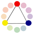
PRIMARY COLOURS-
Primary colours are made up of three key colours, they are the making of any other colour. The three primary colours are red, yellow and blue. these colours cannot be made from any other colour, hence why they are called primary colours.
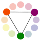 SECONDARY COLOURS-
 Secondary colours are made when mixing two of the primary colours equally making the three secondary colours purple, orange and green.
Orange is made from - red and yellow
Purple is made from - red and blue

green is made from - blue and yellow
TERTAIRY COLOURS-
Tertiary colours are made when you mix primary and secondary colour together with a ratio of 2:1, primary to secondary. this allows different shades of red, yellow, blue, green, purple and orange.

COMPLAMENTARY COLOURS-
These are colours located opposite to each other on a colour wheel, they show a contrast as they are the colours that are most opposite to one and other.

ANALOGOUS COLOURS-
These are colours that are located next to one and other on the colour wheel, this shows the most similar in shade, it can also show how a different mixture of colours can slightly change an outcome.
 On one side of the colour wheel there are the colours that are known as 'hot' colours and the other side known as 'cold' colours. This is very useful in the making of a magazine as this can help to decipher the mood that your wish to portray.
NEUTRAL COLOURS-
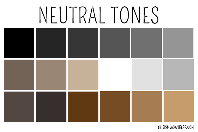
Neutral colours are ones that do not appear on the colour wheel such as white, black, grey, brown and beige. they are colours that can slightly change primary, secondary or tertiary colours to create different shades. they can layer over colours easily and can be mixed and matched.
ACCENT COLOURS-
these colours are uses very little at a time, they are used to bring out a colour brightening the colour scheme. they are also known as a complimentary colour as they work best when the colour is bright or strong colour.
COLOUR HARMONY-
colour harmony is when an arrangement of colours becomes pleasing and attractive to the eye. when this is shown it is known to entice the reader as it shown professionalism and order as it is a balance of colour.
when colours together are not harmonious this means it comes across as boring, allowing reader/viewer to become uninterested, not one that is wanted when in the creation of a magazine. on the other hand it colour come across and busy and untidy, this can also cause the reader to not want to look as the brain rejects what it sees. this is due to colour harmony simulating order, this is why it is so important.

No comments:
Post a Comment